UI shell header
This header is part of the Carbon UI shell. A shell is a collection of components shared by all products within a platform. It provides a common set of interaction patterns that persist between and across products.
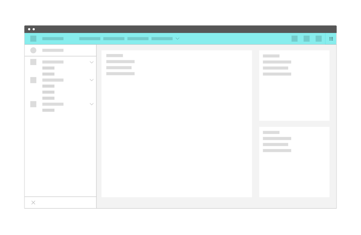
UI shell header
Resources
General guidance
The UI shell is made up of three components: The header, the left panel, and the right panel. All three can be used independently, but the components were designed to work together.
| Shell UI component | |
|---|---|
| Header | The highest level of navigation. The header can be used on its own for simple products or be used to trigger the left and right panels. |
| Left panel | An optional panel that is used for a product’s navigation. |
| Right panel | An optional panel that shows additional system level actions or content associated with a system icon in the header. |
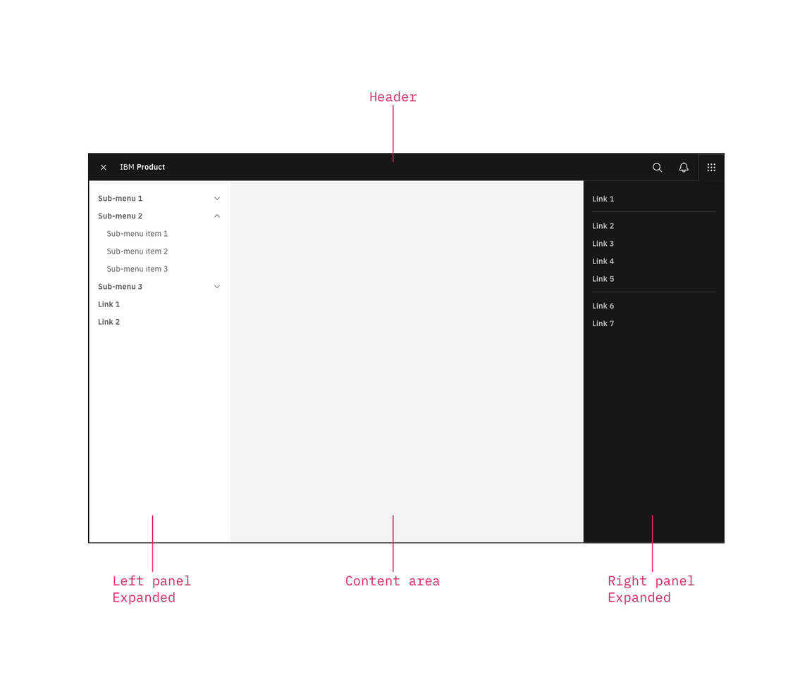
UI shell components
For each UI shell component, left-to-right translates to product-to-global. The left side of the header contains items relevant at the product level. Moving to the right along the header, the functions become more global. Elements in the middle of the header should represent system-level controls. Elements on the right side of the header, such as the switcher, are the most global in their scope and span multiple products.
Anatomy
The header spans the full width of the viewport and is the topmost element in the browser window. Header elements are persistent throughout the product experience.

Primary header
Header elements
Hamburger menu
The hamburger icon is used to open product navigation such as the left panel.
Header name
For IBM products, the header name is always preceded by “IBM.”
Header links
Links in the header are supported as product navigation, if required. These links move to the side menu in narrow screen widths.
Sub-menu
Sub-menus are supported as product navigation, if required. Include the down-pointing chevron after the link label. Sub-menus open on click and are closed by either selecting an item in the menu, clicking outside the menu area, or clicking on the menu label. When open, the chevron should point up. Sub-menu labels serve only to open the dropdown; they cannot link to another page in the product.
Header utilities
These utilities are reserved for universal, system-level functions such as profile, search, notifications, and similar functions. Not every product on a system is required to show the same utilities, but it is recommended for a better cross-product user experience.
Switcher
The switcher provides a way for the user to easily navigate between products and systems. Recommended uses for this component include recently used apps, frequently used apps, or all apps attached to the user’s account. If the list is a manageable size, include all apps or products available on the system.
Links to related systems should also live in the switcher. If you’re building a product for IBM, your switcher should include a link to IBM.
Icon placement
Icons are not a required element of the header and a product may choose to use any set of icons for their UI. Icons should always be aligned to the right of the header with no gaps between icons.
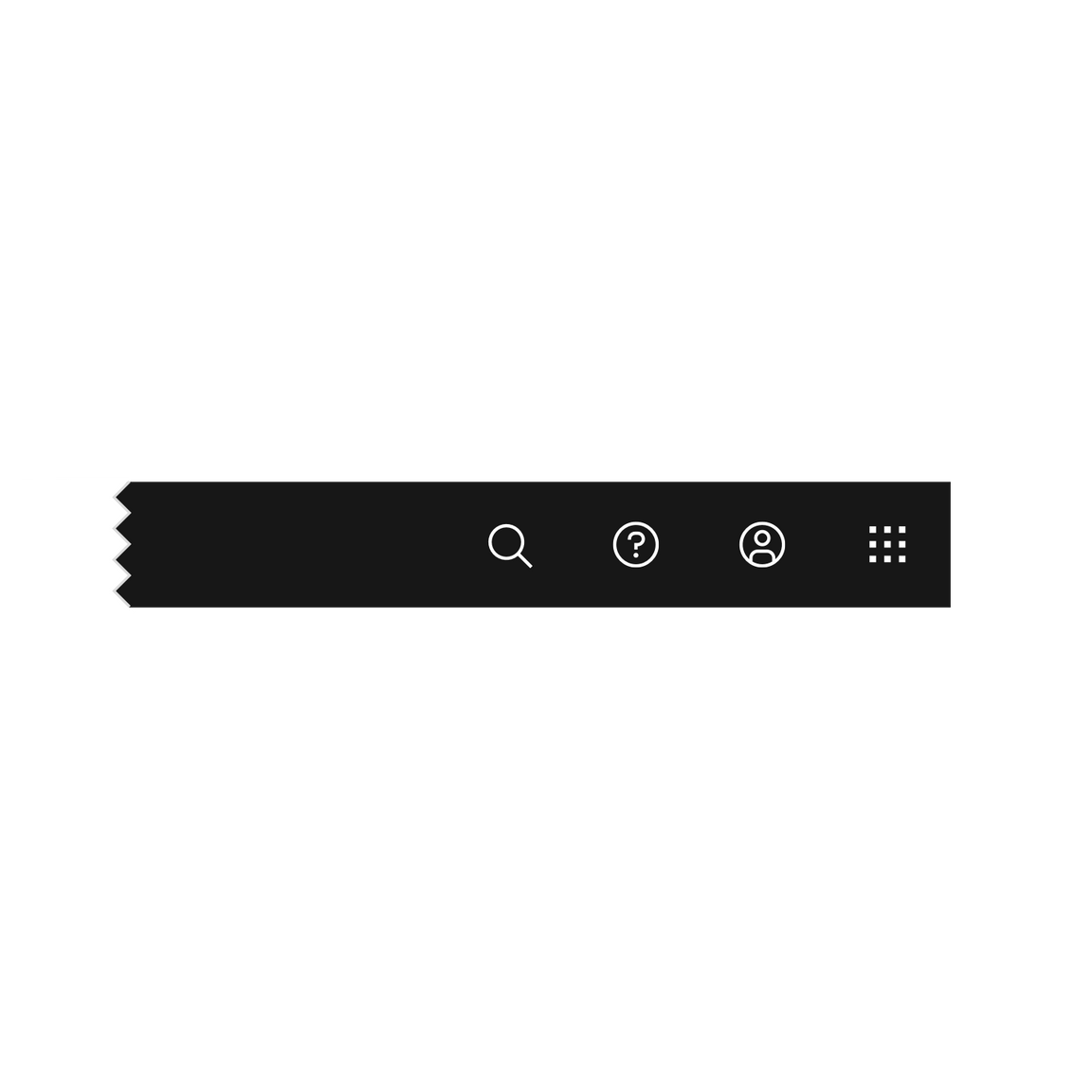
Header utilities are right aligned with no gaps
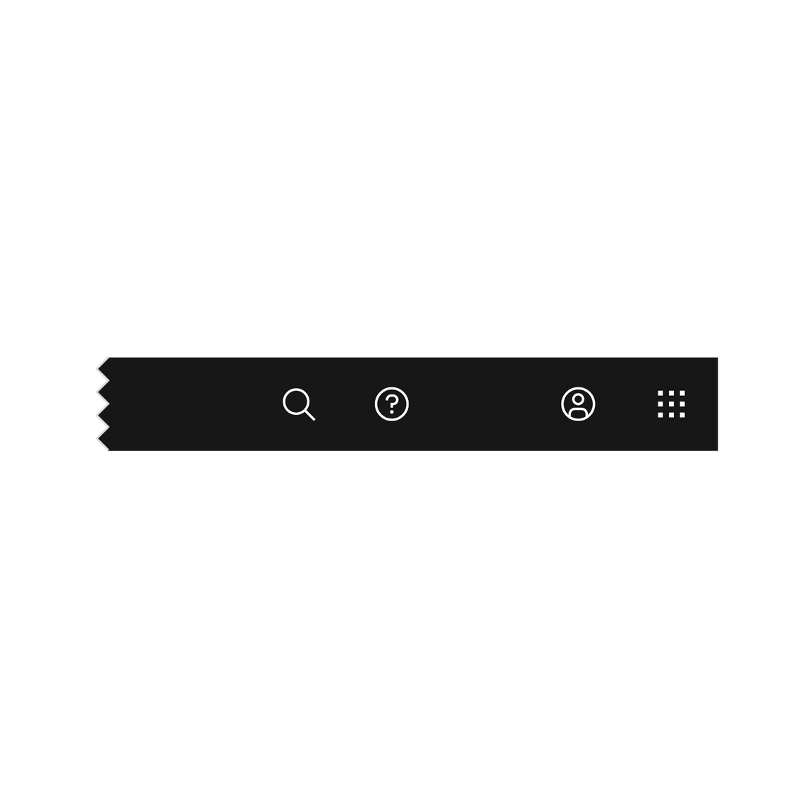
Header utilities with a gap between the account and help icons.
Example placement
The example below shows a header with a switcher, three core icons, a product icon, and search.

| Icon | Position | |
|---|---|---|
| Search | Left | Search should always be positioned as the furthest left icon. This is to allow for a expanding search field that does not disrupt other icon positions. |
| Other | Right of Search and left of core icons | The number of header icons a product uses may vary. This placement will help avoid disrupting the position of the core icons and inconsistencies as your user navigates between other product shell headers. |
| Help | 4th from the right | |
| Notifications | 3rd from the right | |
| Account | 2nd from the right | |
| Switcher | Right | The switcher should always be positioned as the furthest right icon. This ensures the icon does not shift when navigating across systems. |
Behavior
As a header scales down to fit smaller screen sizes, header links and menus should collapse into a left-panel hamburger menu. See the examples below to better understand the header’s responsive behavior.
If your UI includes a left panel, the header links should be added above the left panel items, pushing them down accordingly.
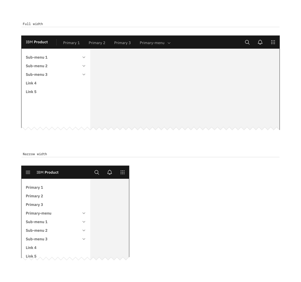
Header responsive behavior